Case study
Smart Press
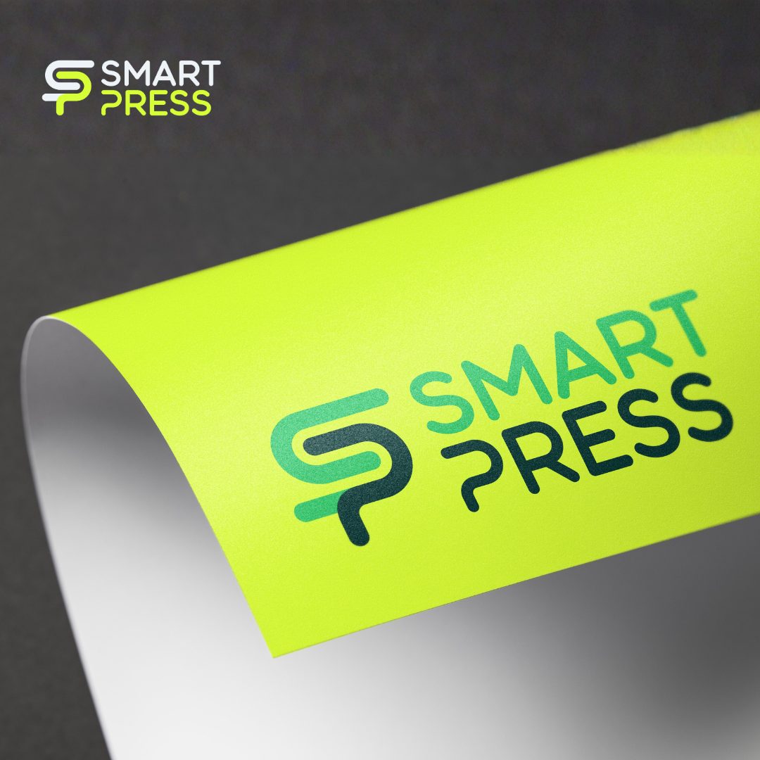
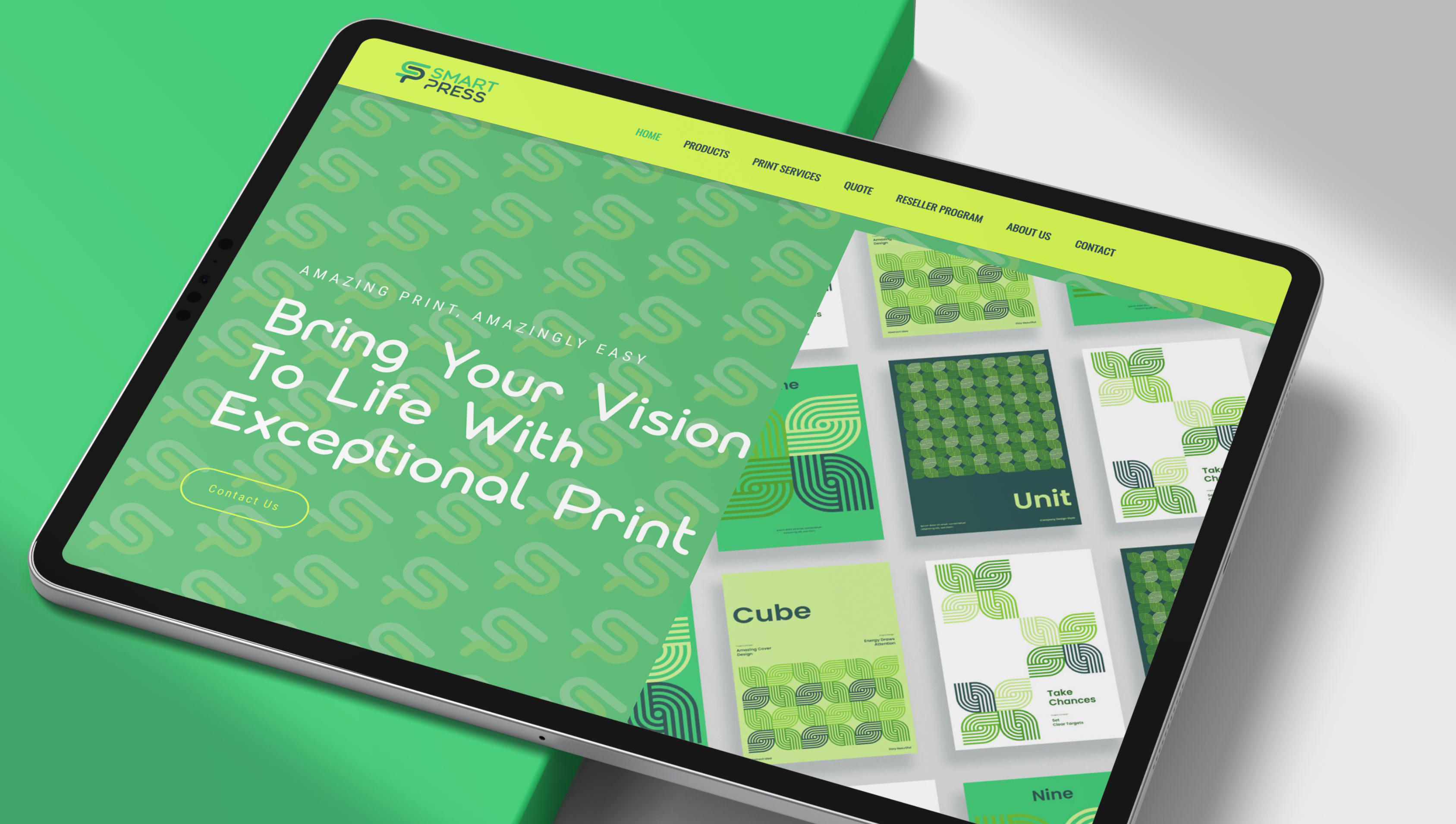
Formerly Satellite Print, Smart Press needed a statement brand to match its ambition — built around a bold, flexible “SP” mark that scales across print and digital.
Smart Press: Digital Printing
Brand Identity, Digital, Content Design
2026
The brief
A sharper brand. A clearer position.
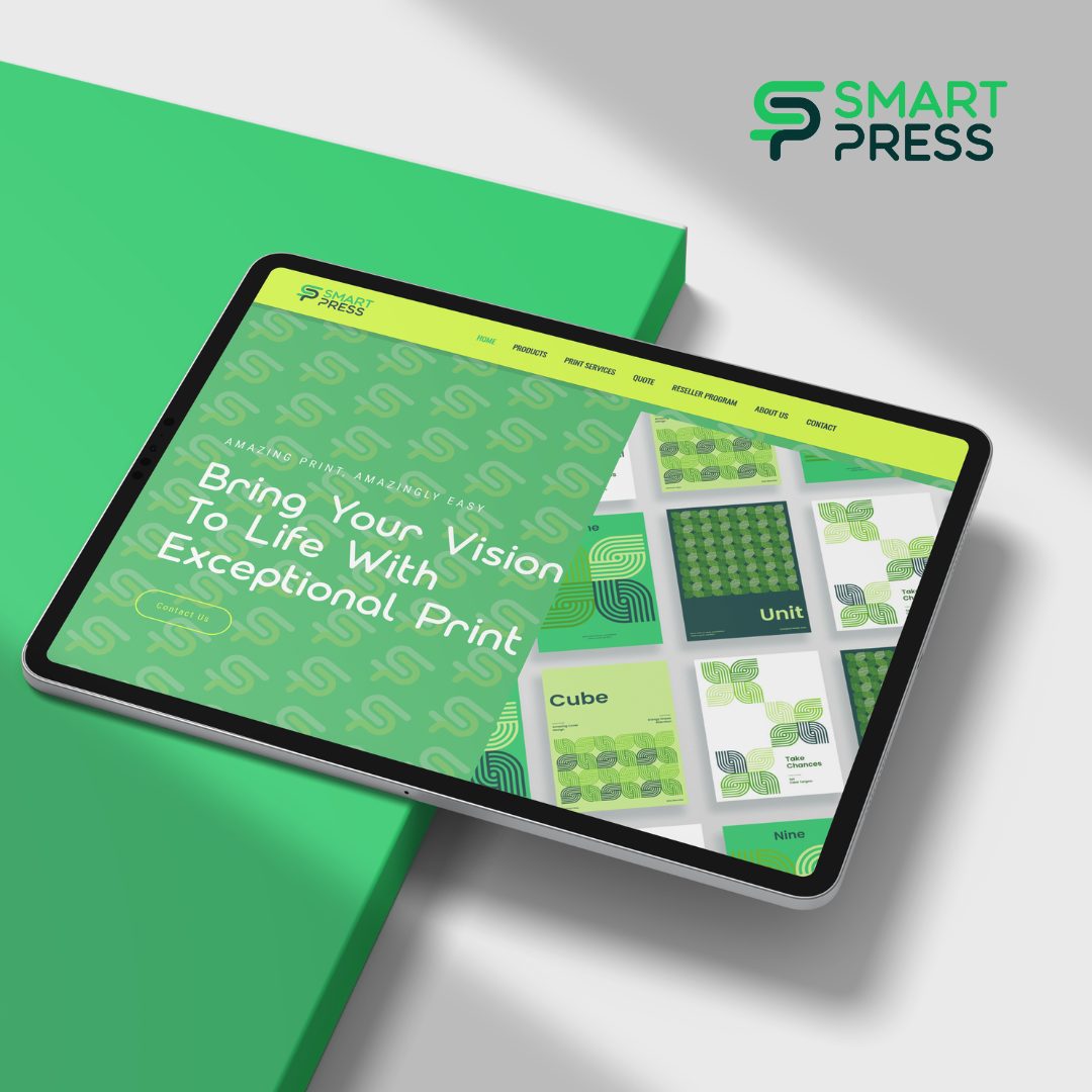
The brief was direct: build a statement brand that cuts through a crowded, often generic print market. Confident, modern, built to compete. I developed a bold, flexible identity around a distinctive “SP” mark — a graphic system built to move, scale and repeat across print and digital, so the brand is instantly recognisable wherever it shows up.
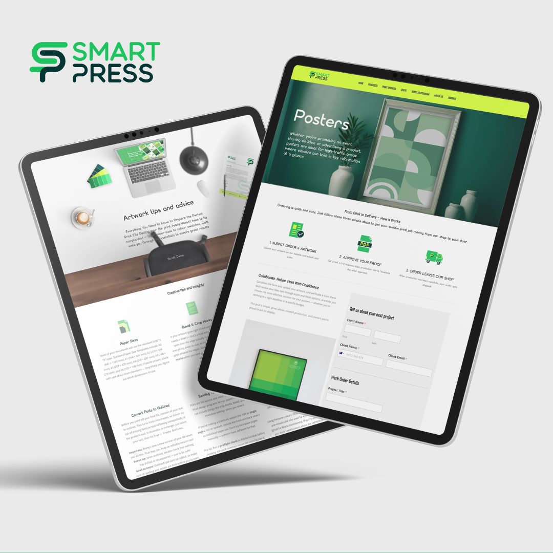
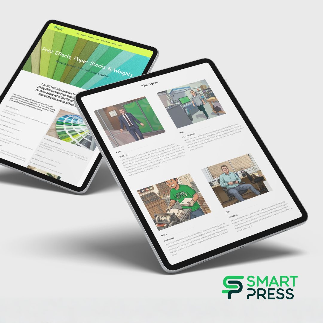
The website carries that thinking through — clean, fast and highly visual, built to show off capability and make it easy for clients to get a project moving fast.
The work