Case study
Football Canterbury
Rebrand for Football Canterbury — from a combative, authoritarian shield to a crest built to protect and unite 31 clubs.
Football Canterbury — a member of Football NSW
Brand Identity, Logo Development
2024–2025

The brief
Respecting the past, modernising the identity.
Football Canterbury’s old branding no longer matched who they’d become — outdated, inconsistent, and disconnected from an organisation mid-shift from Canterbury District Soccer Football Association to Football Canterbury. The brief was to respect that heritage while moving the identity forward, not erase it.
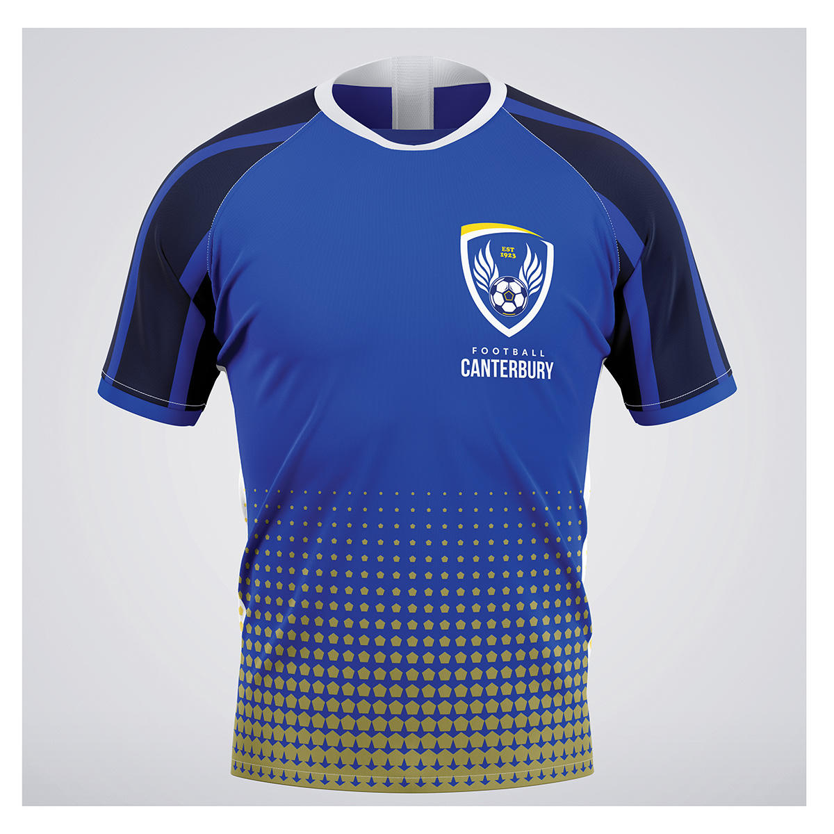
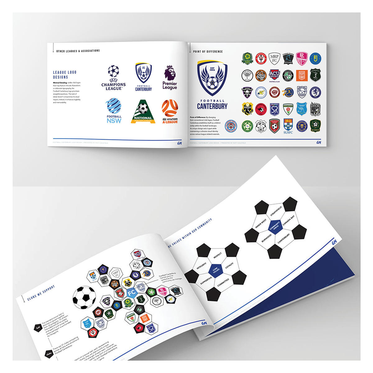
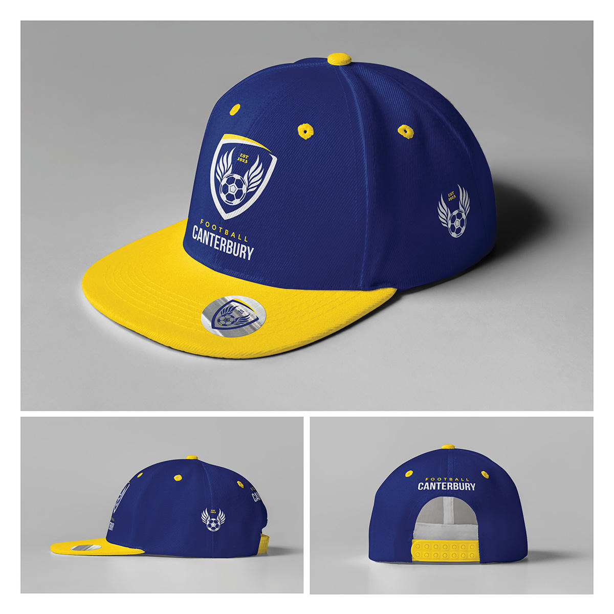
I built the new crest around 32 polygons on the ball — one for each of the 31 clubs it serves, with the central polygon representing Football Canterbury itself. I shifted the shield from combative to protective, added wings to signal support and loyalty, and kept the original gold and yellow stripes. Five recurs through the design deliberately, echoing the organisation’s five core values and the five communities it serves.
The work